top of page
WEBSITE DESIGN
MICROSOFT WEB DESIGN +
DESIGN SYSTEM
Microsoft has many new product launches, product upgrades, and seasonal promotions. All of these changes need to be reflected on their Consumer and Commercial websites. Microsoft and Wunderman Thompson had a long history of collaborating on creating state-of-art web projects, and there is a set process the team often followed when implementing any changes. I will use one case study to demonstrate the design process, and what the role of the UX team was to promote user centered design.
CLIENT
Microsoft
ROLE
Cicy Hou, Adam Prince:
UX
Naushad Huda:
Strategy, Data
Ariel Ouziel: Design
TOOLS
Microsoft suite
Figma
Pen, paper


DESIGN PROCESS
There are many opportunities for redesigns and updates to the Microsoft site. With the release of Windows 11, Wunderman was tasked with redesigning and updating a series of web pages.
No matter the size of the project, this was our design process:

DESIGN SYSTEM
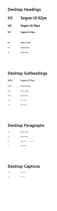
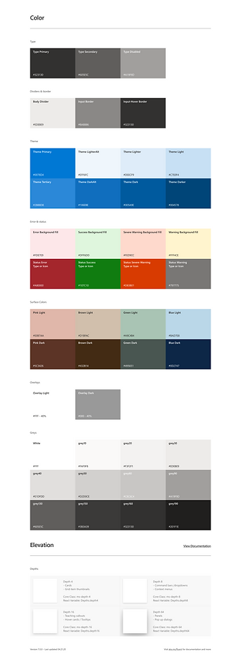
The current Microsoft websites are mainly built with 3 design systems, there are some overlaps between the design systems, additionally many of the components looked similar or have minor differences. To make the overall look and feel consistent, Microsoft wanted to use only the Red Tiger design system for all new pages and updates going forward.
In order to implement this, we needed a complete inventory of all the Red Tiger components.
We then conducted a design audit of the current websites and made an inventory of existing styles.

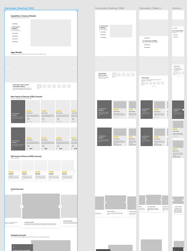
WT was only responsible for designing the websites for laptop dimensions, in the existing design system doc, we only had components for one dimension. Although we didn't need to design for other sizes, it would be important to know how the components would look on different interfaces.
We used the Inspect tool on Chrome to manually edit the dimensions, and found out the exact size of each component for 4 different dimensions: Large laptop, standard laptop, tablet, and mobile. We grouped the components by style and usage, then mapped the components into our design system.

STYLE GUIDE

When building a design system, it's important to reflect on the UX principles behind it. For the UX team, we are always involved from the very beginning to ensure the components/pages have a useful purpose to users. Then we pass the initial designs to the dev team to have it run properly. Then we come together to check whether the design delivers the right information at the right time and place. Finally, the design and copy team add the final touches to give our users a pleasurable experience.
.png)
BACK TO SCHOOL CAMPAIGN
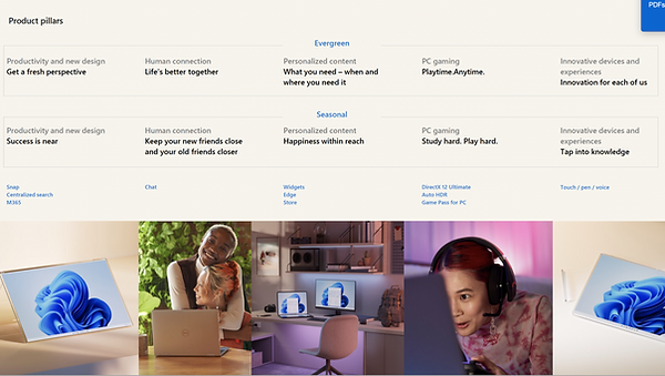
The Back to School campaign usually happens every year around August to September, this year we were given the task to redesign and update certain Windows pages with the following business goals in mind:
Communicate the value of Windows 11 (and Windows 10) through a relevant, humanized experience that drives excitement and consideration.
Increase device sales by driving Windows 11 and support users to confidently select the right device with the knowledge that they are upgrade eligible (as well as avoid stalling sales of existing Windows PCs).
Increase “energy and confidence” to support consideration (especially for Active Seekers, Millennial Moms and Gen Z target audiences).
We were also given a toolkit that has the suggested design objective, priorities, key audiences etc.


With these key information in hand, the UX team did several discovery sessions in Figma. During this early phase, we would carefully review the pages in its current state and provide possible updates and improvement suggestions based on the client brief, and data analysis from our internal team.
Click Through Rate (CTR) for Homepage
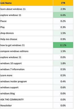
Based on current clickthrough rate, How to Get needs more prominent placement, at least through the Windows 11 rollout window and until CTR starts to drop below top-level panels.
Increase prominence of devices panel for all users, and add a Laptops for College Students callout.
Add a clear image/message tied to BTS to the device panel to help inspire confidence. The best devices come with Win 11.
Using Figma, we went through each section of the Homepage and provided recommendations for change and update. In general, we recommended to update the overall look and feel of the page based on the toolkit provided by the client. Referred back to the data analysis, we determined which CTA would stay or go, and the best position and style for it given its purpose. We also examined each module to judge on its relevancy and appropriateness for the Back to School campaign.
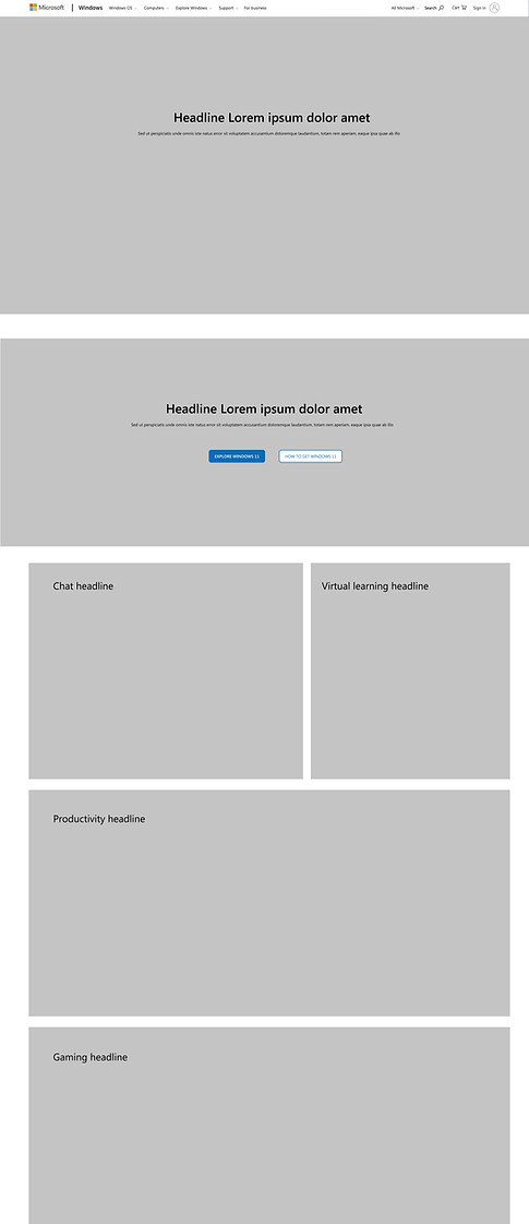
Discovery
Wireframe

Click Through Rate (CTR) for Learn About Windows page
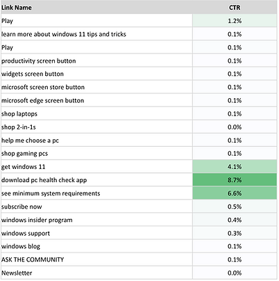
Consider introducing alternative paths to reduce exit rate: Tips and tricks, devices, as well as Entertainment and Gaming to align with the focus of priority demographics.
Increase prominence of device panels, but with a message geared towards "The best devices come with Win 11”; update with BTS imagery.
Increase prominence of How to Get for all users, and PC Health Check and System Requirements for Desktop users.
Consider more on page content that allows users to Compare Windows versions to see what's better in Windows 11.
The same discovery and review process were used for the Learn About Windows page.
Discovery

Wireframe

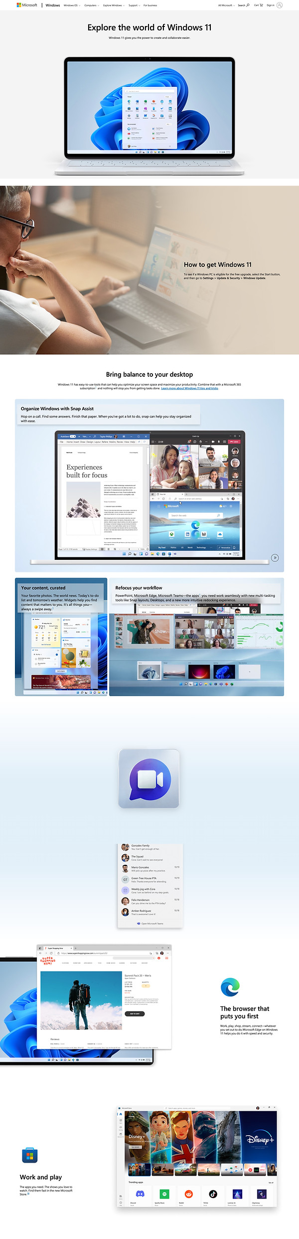
FINAL DESIGN
Once the wireframes have been finalized with the WT internal teams and the client, the UX team collaborated with the Design team to bring the designs to life. During this process, we also kept constant communication with the developers to ensure the designs we envisioned can be done within budget and time.
(a cropped version is shown here, to see the full version, either click on the image or the name of the page)
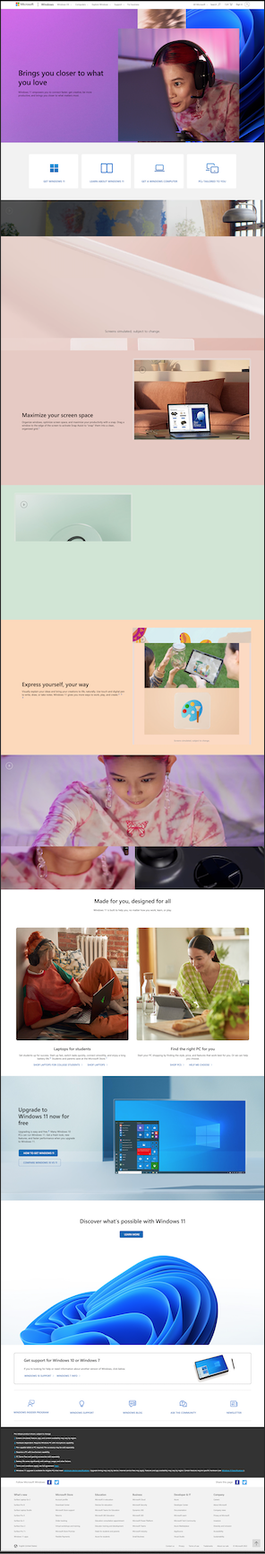
(a cropped version is shown here, to see the full version, either click on the image or the name of the page)
bottom of page