top of page
Enterprise Internal App (Zebra)
HOME DEPOT
ORDER FULFILLMENT APP (INTERNAL)
During COVID-19, The Home Depot saw a surge in BOPIS usage as customers minimized in-store time. The Order Fulfillment app went through rapid implementation of new features by different design teams led to inconsistent visuals, confusing user flows, a poor usability score of 51, and reduced efficiency for associates whose performance metrics were affected. I was tasked with researching these usability problems and redesigning the app to create a more intuitive, consistent BOPIS experience that would benefit both customers and associates during this high-demand period and beyond.
CLIENT
Home Depot
ROLE
Cicy Hou:
UX, Strategy
Griffin Peterson:
PM
Kunal Kumar & 10+ engineers:
Engineer
TOOLS
Figma
Jira
Miro
Microsoft Office Suite


THE CHALLENGE
The Order Fulfillment App is a critical internal tool used by over 400,000 Home Depot associates nationwide to process online and in-store customer orders. The app guides associates through the entire fulfillment process—identifying products, locating them in-store, and staging them for customer pickup. However, the accelerated, decentralized development approach necessitated during the COVID-19 pandemic created several significant challenges:
-
Inconsistent visual design elements throughout the application
-
Fragmented user journeys that caused confusion and reduced operational efficiency for store associates
- Poor UMUX score of 51 in formal testing
How might we create a more intuitive, consistent, and efficient experience that would better serve both customers and associates during the post Covid period with heightened demand to order online and pick up in store?
THE RESEARCH
I used a triangulated research approach to thoroughly identify UX issues from multiple perspectives. By combining heuristic evaluation (to uncover standard usability problems), contextual inquiry (to observe real-world usage patterns), and in-app feedback (to gather quantitative feedback), I developed a comprehensive understanding of both the technical limitations and the practical challenges associates face when using the app. This multi-method strategy ensured that my findings reflected both objective usability issues and the lived experiences of actual users.
Heuristics Evaluation of the app
Performed a comprehensive heuristic evaluation of the app, applying established UX principles to systematically assess the application's usability. This review method identified a series of interface issues and usability barriers by evaluating the product against recognized design standards, revealing opportunities for improvement that might not be apparent through user testing alone.
As a result of the evaluation, the application exhibited severe usability deficiencies, violating 9 out of the 10 established usability heuristics—a critical concern that demanded immediate attention.


These are a few example of several key instances of heuristic violations revealed both the depth of the usability issues and the diverse nature of problems plaguing the application's interface and functionality.
Rule 3: User Control and Freedom - Users should leave the unwanted state without having to go through an extended dialogue. Undo and redo.

Violation: Once the user started the product picking process, they no longer have the option to go back
Use case 1: when at least 1 item has been picked, the back button is presented but user can only either stay on the page or move forward to Printing stage
Use case 2: After user moves to the Printing stage, no longer have the option to pause, save progress or exit, forced to finish staging
Take user to the next stage - Printing
Rule 4: Consistency & Standards -Users should not have to wonder whether different words, situations, or actions mean the same thing.
Violation: Visual inconsistencies throughout the application, with button styles, colors, fonts, and spacing varying unpredictably across different screens and features.

Rule 5: Either eliminate error-prone conditions or check for them and present users with a confirmation option before they commit to the action.

Violation: Users frequently advanced unintentionally to the Printing stage with no option to reverse course, forcing them to complete the entire printing and staging process regardless of their original intent.
In-person interview & task analysis
Conducted contextual inquiry with 11 store associates from 2 locations, representing diverse experience levels and role responsibilities. Shadowed associates throughout the store to observe authentic app usage in real working environments, capturing natural interactions and identifying pain points within actual workflows.
During in-person interviews with associates across various roles and levels, I developed a comprehensive understanding of their typical app usage patterns, identifying both favored features and significant pain points. These sessions revealed a wide spectrum of issues affecting their workflow.
Shadowing the associates on the store floor was eye-opening - I saw how quickly they had to move around to pick and stage items within tight time limits. I was almost jogging to keep up with them. This fast pace meant they had very little time or attention to spare for processing information on their screens. I also found that some potentially helpful features went completely unused because associates simply didn't know they existed nor had the time to explore.


“When the order is cancelled, I don’t know until the printing stage, I just picked all those things for nothing”
“Need assembly notes in OFA”
"System goes down all the time"
2 Operations Manager
1 Department Supervisor
1 Customer Experience Manager
1 Specialty Assistant Manager
6 Order Fulfillment Associates
In-app feedback
Analyzed two months worth of customer feedback submitted through the in-app feedback button. From a total population of 789 responses, we reviewed a representative sample of 202 reviews (providing a 90% confidence level with a 5% margin of error). The sampled reviews were then categorized to identify key themes and insights.
After organizing all the reported problems, I discovered that the vast majority of associate complaints were related to technical or system issues, such as the app freezing or glitching, which required restarts. Surprisingly, only about 2% of complaints were directly related to user experience design problems.


DESIGN & SOLUTION
After thoroughly researching and understanding the app's existing issues from multiple perspectives, I met with the engineering team and product manager to gain their insights. Together, we identified and prioritized features that would deliver the most value to users while meeting business objectives within our project timeline. These are examples the use cases and how we approached on making a collaborative decisions.
Use case 1: User has started the picking progress and wanting to go to previous page
Current Process:
When the back button is pressed, the pop up window comes up


Stay on the same page
Take user to the next stage - Printing
To make this experience more user friendly, I shared 3 different design options with the project team and stakeholders, during the workshop we went through each option and discussed the pros and cons.

Future State Option 1:
I proposed displaying the remaining pickup time in the page title to create urgency without restricting navigation. This addressed a key challenge: the current design prevented users from pausing or going back because each order operates under strict time constraints. My solution maintained business priorities while improving user control.
Future State Option 2:
In this design, I relocated the countdown timer from the header to the main content area. This placement still communicates the time constraint to create motivation, but presents it in a less prominent way to reduce excessive pressure on users.
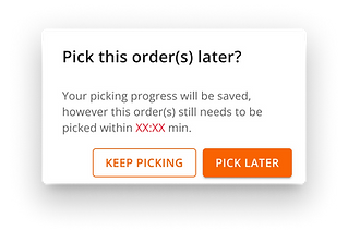
Future State Option 3:

In this more restrictive design approach, returning to the previous screen comes with the consequence that all picking progress is discarded. This creates a stronger incentive to complete the current workflow without interruption.
We selected option 3 as it best balanced the business priority of encouraging rapid task completion with improved user experience. Unlike the previous version, this design clearly warns users that choosing "Stop Picking" will result in lost progress, allowing them to make an informed decision.
Use case 2: User is in the Picking Stage, not all items in the order has been picked and the "Continue to Picksticker" button is pressed
Current Process:


Once the user is on the Printing stage, they are forced to move forward, and no way to go back or pause
Future State Option 1:

When the user clicks the "Continue to Print Picksticker" button, a pop-up window will appear on the same page. This pop-up provides the user with an opportunity to pause and confirm whether they truly intended to proceed, especially when not all items have been picked.
Future State Option 2:
This pop up window will also remain on the same page but with a generic message to check whether the user has completed picking.

Future State Option 3:

This approach respects the user's intentions by immediately advancing them to the Printing Stage while providing a safety net. A discreet message at the bottom of the page allows users to return to the previous screen if they didn't mean to proceed.
We chose option 1 because it clearly outlines the consequences (order becomes a partial pick) of proceeding without picking all items while still allowing users to continue if that was their intention.
Use case 3: User started picking but encounters an app crash or manually force closes the app before returning to the picking process
Current Process: both CTA options require the user to start over on picking the order, no true Resume feature

No progress has been saved, user needs to start over
User needs to re-pick the order

Future State Option 1:

With the new IT system upgrade, user will have the ability to resume order, I want to provide all the order information so user can make an informed decision to either resume or unlock (all picking progress will be lost and the order goes back to the available list)
Future State Option 2:
This design presents information in a clean, straightforward format. By positioning "Resume Picking" as the primary call-to-action, we're guiding users toward our preferred action.
For users who select "Unlock" instead, we've added a security confirmation step to ensure this choice is intentional.


USER FEEDBACK & IMPACT
I conducted in-store user testing of the final pick design with 8 Home Depot associates representing various roles and experience levels. After walking them through the use case and having them navigate the prototype, I gathered their feedback on the clarity of the copy and format. The consensus was strongly positive - all participants found the new experience significantly more intuitive and user-friendly compared to the current system.
-
Improved Usability - The app became more intuitive, reducing errors and frustration
-
Increased Efficiency - Associates could complete tasks faster, meeting the pick time goal
-
Improved UMUX Score - When I tested the score again with the features I improved, the score went up by 40%
bottom of page