APP DESIGN
SOCIAL APP RE-DESIGN
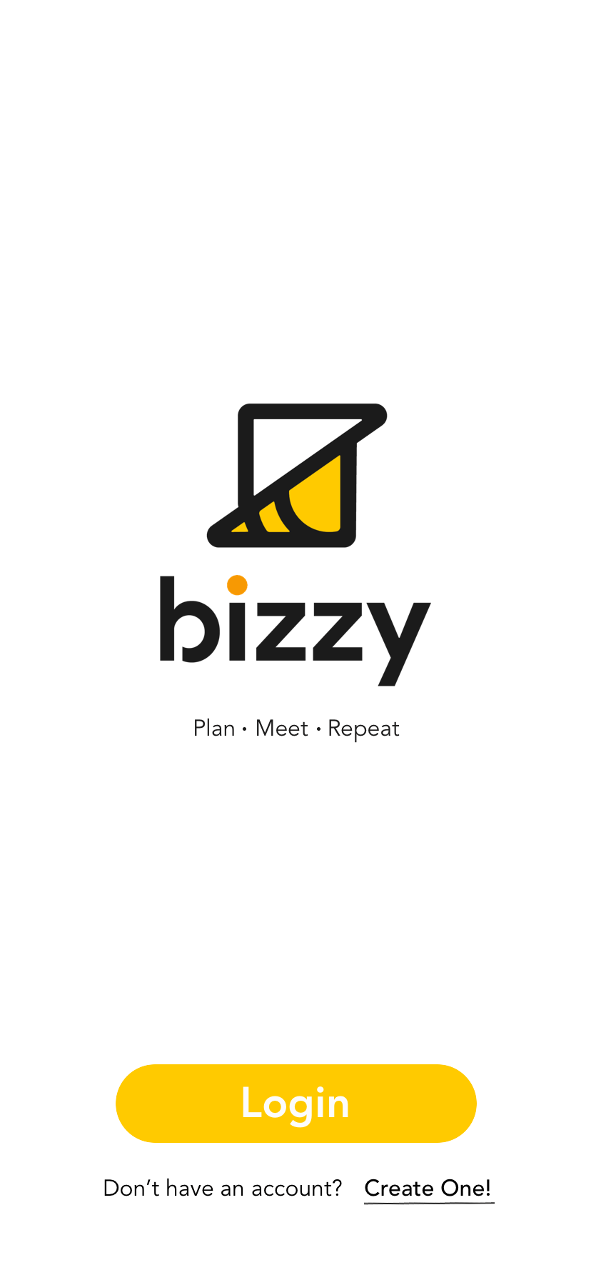
Bizzy is a new social calendar app with a vision to be the "go to" app when making plans with friends and loved ones. The goal is to make the planning process fun and easy.
CLIENT
Bizzy
ROLE
Cicy Hou:
PM, Research, Design
Dana Chen:
Research, Prototype, Design
TOOLS
Google suite
Sketch
Principle
Pen, paper


CHALLENGE
Bizzy has been on the market for two years, despite the effort to market through different channels, the total number of users remained low. Bizzy has been seeking feedback and suggestions from their users, but there seems to be many contradicting needs and wants.
Bizzy is hoping they can gain a better understanding of their target audience in a systematic way and improve how the app is currently working, in order to grow active users and the company as a whole.
RESEARCH METHODS

Business
Analysis

Journey
Map
Personas

User
Interview

Task
Analysis

C&C Analysis
We interviewed a total of 9 people: 6 females, 3 males, age 20 - 43. Which represented the target audience of Bizzy.
During the interview, we also asked the users to sign in as a first time user and subsequently gave them a task to complete on the current Bizzy app. We were able to collect immediate feedbacks on usability issues.
WHAT ARE WE TRYING TO FIND OUT?
-
what are your current social habits?
-
how do you currently interact with a calendar planning app?
-
what are your fruastrations with event planning?
-
what do you wish was better with your current way of planning outings?
.jpg)

CORE CUSTOMER INSIGHTS
Google/iCloud calendar is king
Almost everyone we interviewed are currently using either Google and/or iCloud calendar. They find it meeting majority of their needs.
Don't make me think!
When it comes to calendar apps, people prefer it to be simple, clean, and logical way to create events and invites.
Color coding is important
People are visual, they like to use color coding to differentiate the type of events they have for the day and week.
Integration is KEY
To convince people to use another calendar app than the current one they are using, at the minimum, it needs to be integrated with Google Cal or iCloud Cal.
Mix review on text msg use
Text msg is the most popular way to plan outings between friends and couples.
People find this method to be cumbersome and inefficient, but do think it works between couples.
TASK ANALYSIS
Observing users with the app gave us real time insights on their preferences, challenges while completing the task that was given to them.
USER FEEDBACK

How the app currently looks
Home page

Event form

Event detail

PERSONAS
After the interviews, we combined all the users' struggles, challenges and preferences, and created two personas to humanize our users through our design process. It was really important that we consider both user groups' needs as we go into the design phase.
Bizzy's initial target audience was mainly female, but taken into account the fact that they want to grow the app to be the "go to" app for everyone, we also have to consider male users' needs.


JOURNEY MAP
During the task analysis, users encountered a number of usability challenges. To reveal these issues in a more relatable way to our client, we created a journey map to showcase the couple's thoughts and emotions while using the app to pinpoint challenges users experienced during task analysis.
Persona Jenny and John are a couple.
Social Jenny is the primary user.
Bizzy John is the secondary user - only uses the app to respond to invites instead of actively planning events on the app.

SKETCHES
After we synthesized all the insights and data from the Research phase, and keeping the two personas' needs and preferences in mind. We began to sketch out some ideas.
As a team we utilized Design Studio workshop to explore different design ideas to eventually create a shared vision.
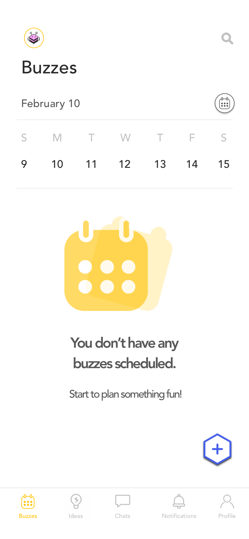
SOLUTION

After rounds of usability testing and iterations...

ACCOUNT CREATION
On the registration page, we took out a couple of originally required fields based on user feedback that they felt the app asked for more than expected up front, before they want to commit to it.
We've added the option to sync to either Google or iCloud calendar. Also provided the ability to not sync to any contacts for more flexibility.
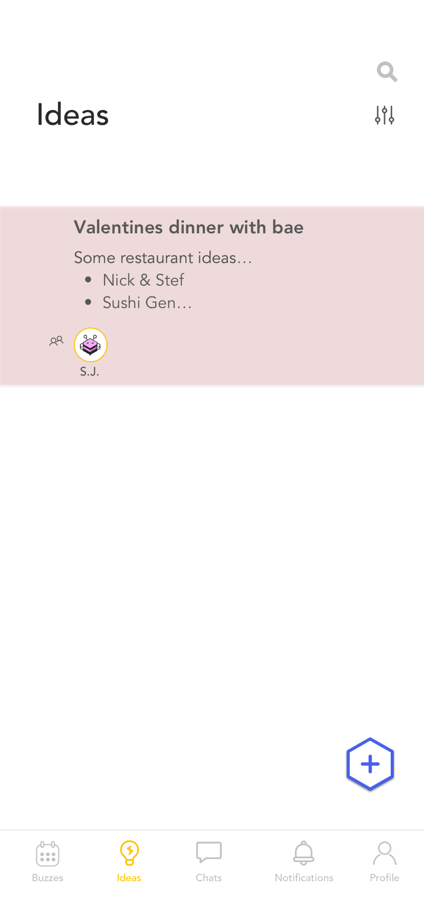
CREATING AN IDEA
One of the unique features of Bizzy is the ability to jot down your outing ideas and convert to an event once the details are set. However, the feature to do that is called "Spark".
Through interviews, we learned that almost no user knew what "Spark" was meant for - therefore the feature is rarely used. We changed "Spark" to "Idea", made it more intuitive for new users to understand and start using.
We also provided the option to color code to allow for additional customization.

IDEA TO EVENT CONVERSION
In addition to condensing the event form from 5 pages to 1 page.
We also add useful features such as:
-
notification customization
-
map view of the event location
-
weather for the day of the event
EASY ACCESS TO CHAT
In the current design, in order to access the chat function for each event, users need to first find the event. In the new design, chats can be accessed easily through the improved bottom navigation.

RECOMMENDATIONS FOR NEXT STEP
The design sprint was only 3 weeks long, there were other good insights that came out from the interview we wished we could implement in the next design phase.
If we were given more time and resources, we recommend implementing the following would help improve the product even further.
